Latest News
- BRISTOL WALKFEST WALKING SPORTS FESTIVAL
- UNVEILING OUR REFRESHED LOGOS
- Avon Tennis Spring Tournament 2026
- Next Coffee & Chat - 12th March 2026. BOOK NOW
- BNO 2026 - TCKETS NOW AVAILABLE
- Avon Tennis Competition Lead Opportunity
- County Cup Dates 2026
- Avon Tennis AGM
- Play Your Way to Wimbledon 2026
- Funding Opportunities for Open Court
UNVEILING OUR REFRESHED LOGOS
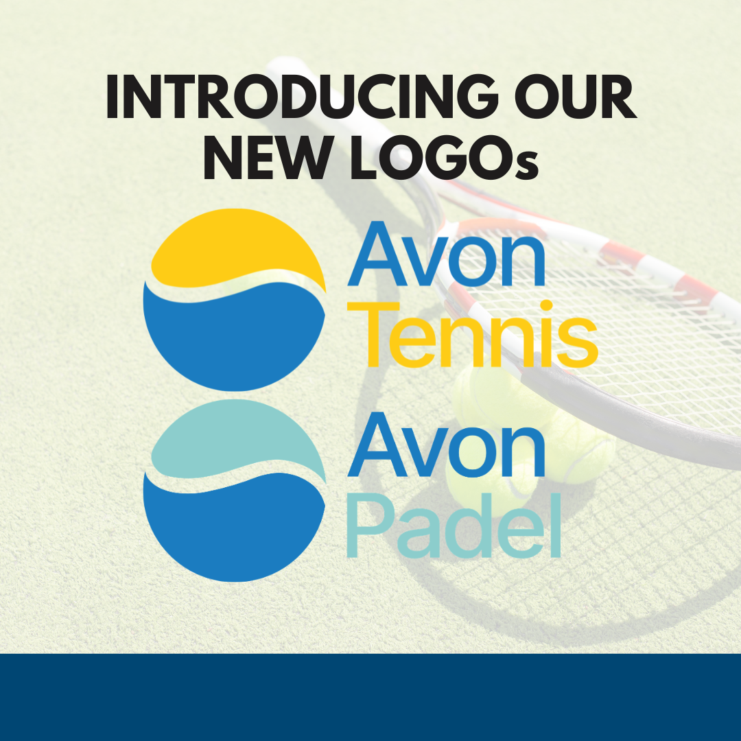
OUR REFRESHED AVON TENNIS LOGO ALONGSIDE OUR BRAND-NEW AVON PADEL INDENTITY
The circular icon remains the same familiar shape but has been streamlined to create a bolder, cleaner, and more modern feel. It retains its two distinctive elements: the optimistic, sunny yellow above the flowing blue water - a nod to the River Avon. The icon also cleverly reflects the shape of a tennis or Padel ball, with the crest of the wave echoing the curved seam you see on a tennis ball.
Alongside this, the updated typography brings a bright, contemporary look, reinforcing the energy and positivity at the heart of Avon Tennis.
You’ll begin to see the new branding across our communications, competitions, and events in the coming weeks. We hope you love it as much as we do.